Pretty bad
And what we don’t know is even worse
It’s hard to distill 3,675 pages into one simple, readable summary. The IPCC, it seems, makes it even harder to do so with its 37-page Summary for Policymakers. The prose is bad. The fact that it’s the least common denominator, heavily negotiated, is worse. So I passed by the 37-page Summary and skimmed the full report.
The first impression is clear: Climate change is already hitting home. In 2010, African countries’ GDP per capita was ~13.6% lower due to climate change (since 1991) than it would have been without. The worst hit? Mauritania with 25%. (Ch.9 p.130 l.7-11, p.131)
Declining rainfall between 1960 and 2000 alone caused a GDP gap of between 15 to 40% in affected African countries compared to rest of developing world. (Ch. 9 p.130 l.17-19)
Yes, highlighting these two impacts is picking out some of the worst of the worst. No, not every country’s economy is equally hit. (Russia’s might temporarily be benefiting from (some) climate change.) But yes, Mauritanian GDP collapsing (or never getting off the ground) matters. Or at least it should.
The IPCC report captures just these kinds of g(l)ory details, and then some.
By now we’re in Chapter 16 with the promising-sounding title “key risks across sectors and regions.” It’s meant to provide the summary of just that, also containing the economic summary statistics.
The first figure is just a nicer table of contents, but it packs a key framing punch: Impacts = hazard × exposure × vulnerability. Yes, it’s about the intersection of the three. Always has, always will be.
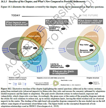
That line, Impacts = hazard × exposure × vulnerability, basically points to every possible response. There’re those who will want to focus on adaptation alone (exposure × vulnerability). There’re those who only want to mitigate (hazard). Newsflash: we need it all.
And no, we can’t just “grow” our way out of climate impacts and risks. Case in point: extreme weather events cause real, direct GDP damage. e.g. Hurricane Maria caused impacts totaling 225% Dominica’s GDP in 2016 (Ch.15, p.27, l.35-41). And those GDP impacts persist, sometimes as long as 10-15 years after the extreme storm. (Ch.16 p.21 l.51-57, p.22 l.1-3) We can’t outrun climate change. Continued warming take us to some hard limits of adaptation. Some places, like small islands, coastlines, and entire regions, will be simply unlivable.
Yes, there are caveats to everything. Chapter 16.2.3.6 on "Water-borne Diseases" notes how "gastrointestinal diseases increase following a heavy rainfall event only if preceded by a dry period,” citing two sources for that statement. It’s how you get to 3,675 pages.
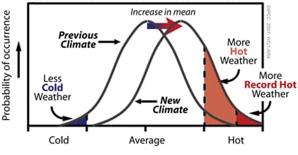
A key bit that shows up over and over again: averages are bad enough, it's the extremes that really hit home. And the extremes increase much faster. That insight isn't exactly new. This 2007 IPCC graph says as much, but it’s always a good point to keep in mind:
One key impact highlighted here: impacts from heat stress! There’s around a 10% drop in labor productivity due to extreme heat-degree days (days above ~90°F/32°C). (Ch.16 p.110 l.9-10)
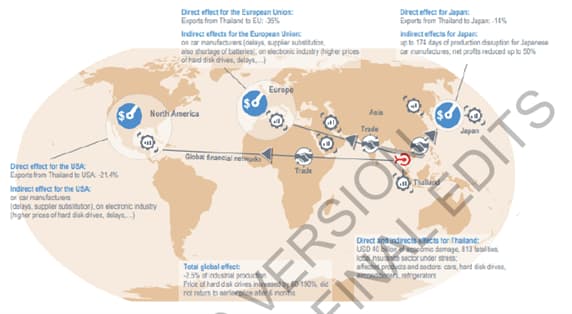
What’s also striking over and over again are the global connections. Here’s the impacts of the 2011 Thai floods, pretty graphic and all. That one flood decreased global industrial production by 2.5%, e.g. increasing computer hard disk prices by 80-190% (Ch.16 p.41).
OK, so what's the so-what?
Well, if you're looking for that one new economic summary statistic that says it all, you'll be sorely disappointed. That's good. Well, bad for the planet, but good in terms of take-away. The one statistic everyone cited from 2014 report was how ~2°C of additional warming would cost us ~0.2-2.0% of GDP. It was almost certainly an understatement then. It looks laughable now.
In the 2022 report, there’s no such (simple) range, however much caveated. Instead, we get lots and lots of different attempts to convey the rapidly increasing risks.
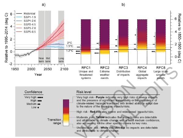
The “burning amber” charts make an appearance:
But the one summary graphic that will likely be the most important is a full-page composite figure, titled “Cross-Working Group Box ECONOMIC.1,” that’s worth showing in full:
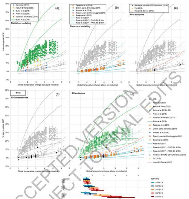
Yes, ideally, we would get away from using “% GDP” entirely, and most of the report does just that. There’s too much detail—too many risks and uncertainties—to pack into one, simple summary statistic. For some uses, though, it’s essential to still try to present that number. Here the IPCC does. Lots of the choices made in doing so will be heavily dissected for years to come.
The high estimates, presented by the green dots, all come from one study (Burke et al, 2015). The lower-end estimates, meanwhile, are all dominated by “structural modeling” and another single study (by Steve Rose, who is also a Lead Author on the report).
How does one reconcile these two approaches? One can’t, and doesn’t.
Making sense of climate damages means grappling with the risks and uncertainties. Doing so, directly and honestly, sometimes falls into the trap of those who claim uncertainty is a reason for climate delay. This is perhaps the most important messaging challenge: Yes, there are uncertainties. Yes, they mean even more action is warranted.
The grand conclusion on that front: words matter. I don’t know whether UN Secretary General António Guterres’s words will stick, but they certainly ring true. He referred to the IPCC report as “an atlas of human suffering.”
In the end, the biggest of big takeaways does come from the Summary for Policymakers: “Any further delay in concerted anticipatory global action on adaptation and mitigation will miss a brief and rapidly closing window of opportunity to secure a livable and sustainable future for all. (very high confidence)”
That is a remarkable statement, not least because it comes from the political summary, the one I promised I’d skip. Any country could have vetoed this line. None did. As the New York Times summarized in one of the better headlines on the report: “Climate change is harming the planet faster than we can adapt.”
Every crisis is an opportunity. Whether with the Russian invasion of Ukraine or the climate crisis, we are very much still in the crisis portion. It also means there’s no time to waste. The time for action is now.